Custom Web Design Built Right
No templates here. Every layout gets built from the ground up—grids, type hierarchy, spacing all calibrated to match your brand. Clean semantic HTML means the code stays maintainable and accessible.

Custom Web Design
We create responsive layouts built on semantic HTML, make interfaces actually accessible, and design visual systems that work across any device.

Softpixel partners with designers, agencies, and tech brands to build custom web experiences from the ground up. That means handling site architecture, interaction design, bringing your visual identity to life, and making sure everything works everywhere. We're transparent about our process too—you're in the loop the whole way, not just seeing the final product. What you get back is code that's ready to ship, paired with design systems your team can build on and maintain long-term. Layouts that line up perfectly, front-end that performs, accessibility that's actually compliant. We design your site like it's going to be the best representation of what you do.
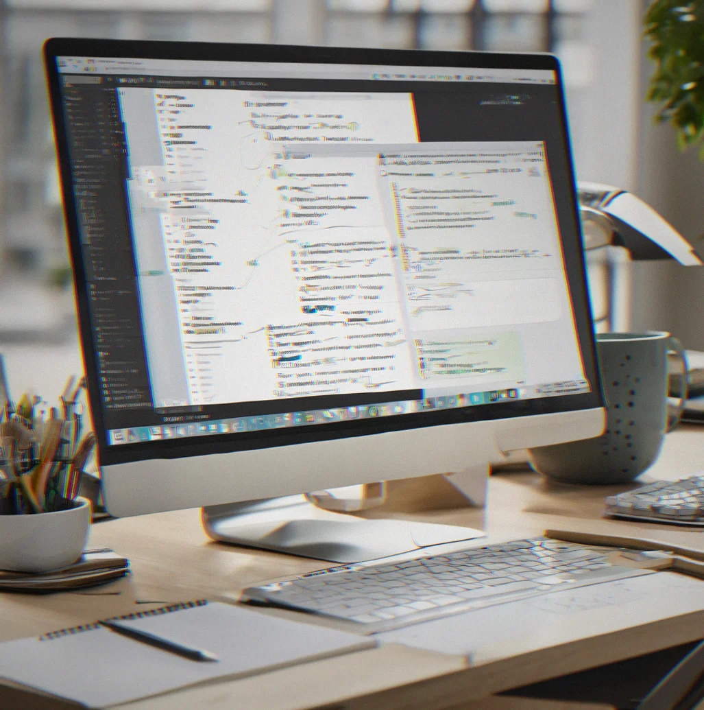
We build with proper markup structure and modular stylesheets. Faster load times, better SEO, and code your team can actually maintain six months from now without trying to figure out why we did things a certain way.

Mobile first. Not slapped on after the desktop version ships. We test from 320px up, treat touch interactions differently than hover states, and optimize images for real-world connection speeds. Your site works because that's how we built it.
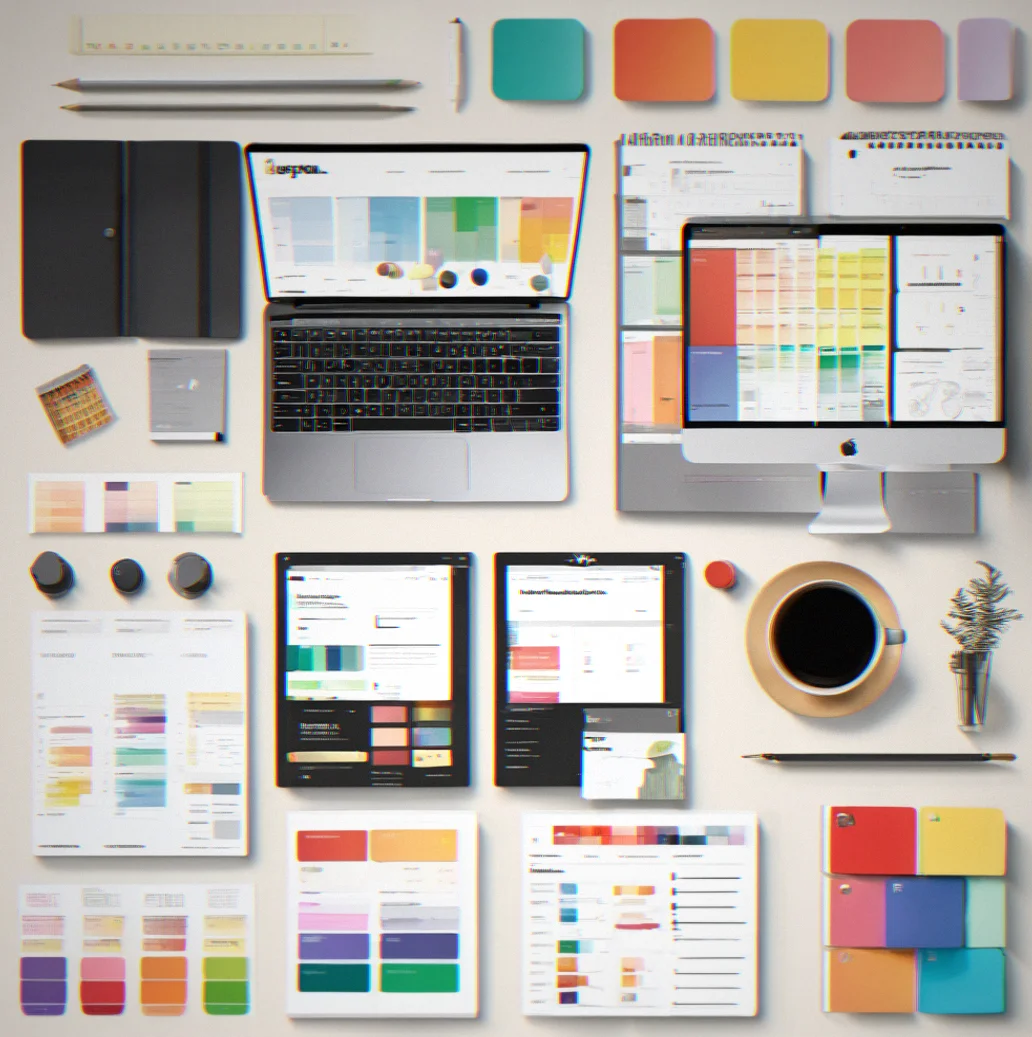
Color palettes, type scales, component patterns, spacing rules—all documented so you can extend the design wifhout losing consistency. your in-house team can add to it. Another agency can take over later. The system holds up.

WCAG 2.1 AA compliance. Keyboard navigation. Screen reader testing. This isn't something we add at the end—it's baked into every choice we make. Users with visual or motor impairments get the same experience as everyone else.
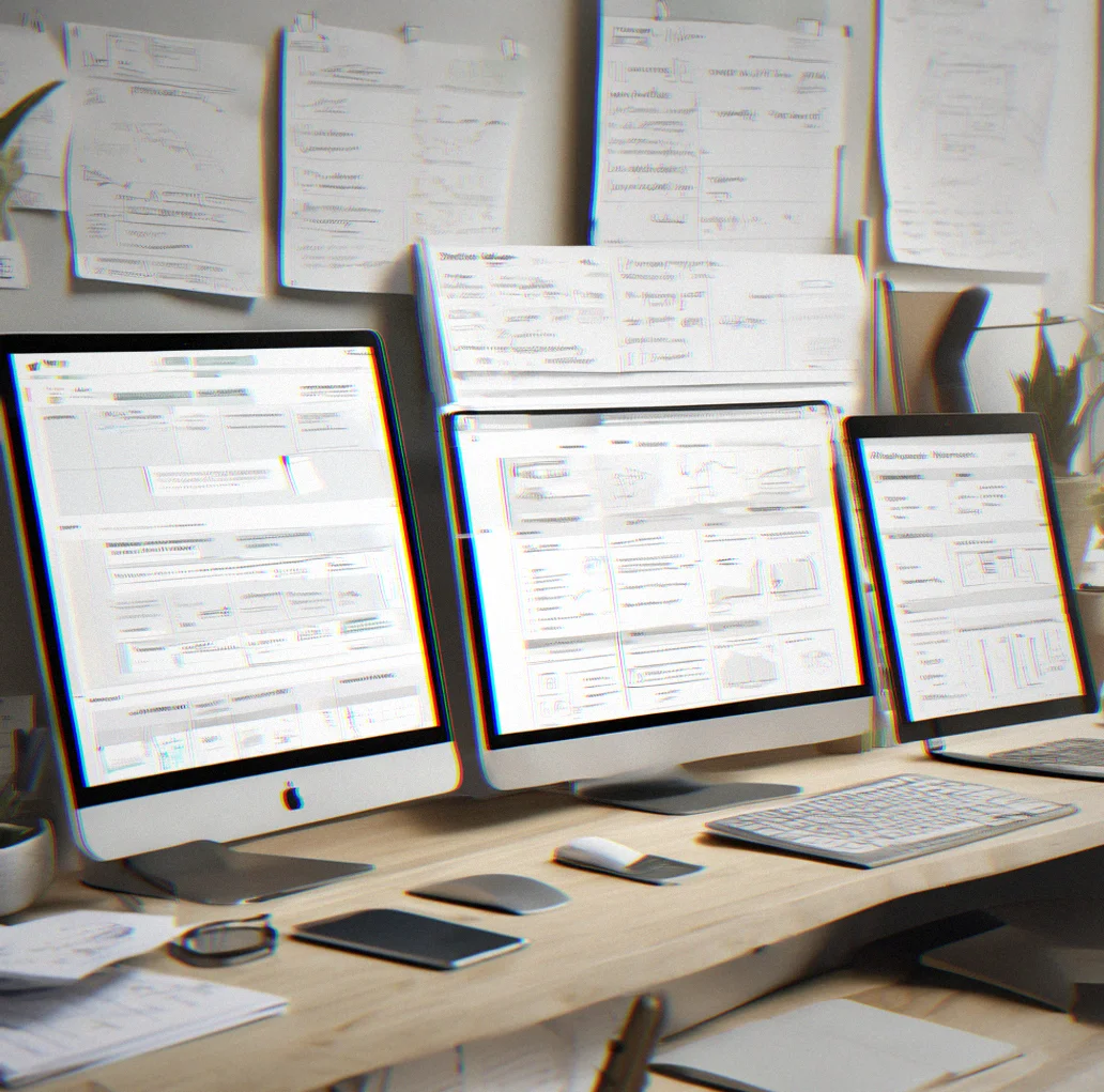
You see how we work. Design specs, performance benchmarks, build notes—we share it all. When we're done, you get the asset files, component code snippets, and maintenance guidelines. No mystery here.
Seven things about our process
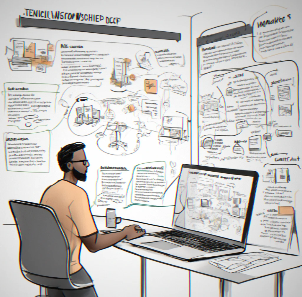
We start by mapping out your constraints: brand guidelines, content structure, performance targets, timeline. The first day and a half is basically just us asking questions. Once we've worked through that conversation, the scope is locked in so nothing blindsides you later.
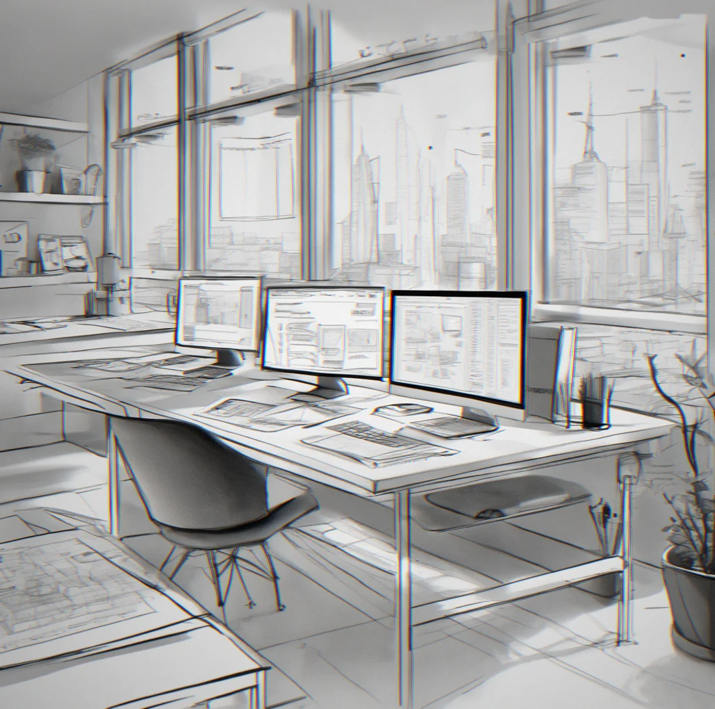
We skip the high-fidelity mockups and go straight to low-res layouts. Grid paper or Figma frames, that's it. This is where we work thruogh information hierarchy and interaction patterns without getting distracted by color or typography.
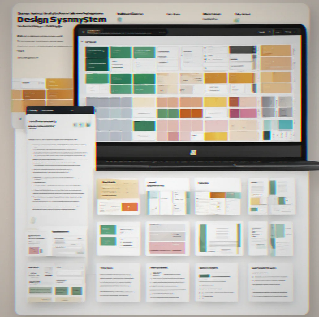
We nail down type scales, color relationships, spacing units and component patterns in a shared file first. Your team gets to see the whole palette before a single line of production code gets written. Everyone's looking at the same system, so feedback loops actually tighten.
Spacing doesn't get eyeballed. Font sizes come straight from the type scale. Colors match the system exactly. We lean on CSS custom properties and semantic HTML so your next developer can understand the logic without having to reverse-engineer what we were thinking.

We test on real devices. iOS Safari, Chrome on Android, Firefox on Windows. Form inputs on touch screens, focus states for keyboard navigation, performance on slower connections. Responsive design actually has to work everywhere, not just look fine on your monitor.
It's not optional. We run axe DevTools, check color contrast against WCAG AA, test with a screen reader, and make sure keyboard-only navigation works all the way through. Accessibility gets baked into the markup from the start, not tacked on at the end.
You get component code, CSS variable definitions, asset export guides and a maintenance runbook. Your team can extend the design or update content without friction. The system explains itself. No gatekeeping.
We handle the full path from discovery through launch, code to design systems included. Here's what that actually looks like.
No templates here. Every layout gets built from the ground up—grids, type hierarchy, spacing all calibrated to match your brand. Clean semantic HTML means the code stays maintainable and accessible.
Most sites break on phones because they were designed for desktop first. We flip that. Start with mobile, scale up from there. Every breakpoint gets tested on actual devices, not just zoomed-out browser windows.
Color palettes, type scales, component libraries—all documented so your team can build on it later witthout accidentally breaking things. You're getting a system your designers and developers can actually inherit.
WCAG 2.1 AA compliance, keyboard navigation, screen reader testing. We don't bolt accessibility on at the end. It shapes how we build from the start. Someone using a screen reader gets the same experience as everyone else.
Core Web Vitals, Lighthouse scores, actual load times on slow networks. Speed isn't just nice to have—it moves conversions and helps your SEO. We compress images, minify CSS, and test on real 4G connections.
You see the Figma files as they get built. Git repos stay visible. Weekly updates on what shipped and what's coming. No black box. Just straightforward visibility into how the work is moving.
CSS custom properties for theming, component-based structure, BEM naming so it's readable. Your developer team picks this up and extends it without having to decode our thinking. Docs are included.
Assets, component snippets, maintenance guidelines. Everything you need to launch it, update it later, or hand it off to someone else. The work's not actually done until you can run it on your own.
We handle the full scope of custom web work. Here's what that means in practice.
We map user flows before opening Figma. Information architecture, interaction patterns, form optimization—that's the groundwork. Then we design. Every pixel has a job. Nothing's there just to look nice. You end up with interfaces that feel natural because they're based on research, not assumptions.
HTML that passes validation. CSS organized by component. JavaScript that doesn't balloon your bundle size. We ship code that actually performs. Lighthouse scores sit in the 90s consistently. Your dev team inherits clean code.
Logo, palette, typography, spacing grid. The whole thing. Your brand looks the same across web, email, social and print because we built it as a system, not scattered pieces. Every element fits together. It's documented so your team can expand it without losing the thread.
Shared design files. Weekly check-ins. Clear timelines. You're not blindsided at handoff. Progress is visible because we keep you involved. Feedback gets tighter. Decisions move faster.
Designers, agencies and brand teams ask us these all the time when they're thinking about going custom with Softpixel. Didn't see your question? Just reach out.